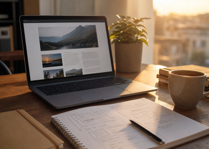
A blog layout is not a decorative wrapper around your writing. It determines how quickly readers can find an answer, understand the point, and decide whether your site is worth their time. Reviewing strong examples of blog page design can help you see how hierarchy, spacing, and navigation guide attention without overwhelming readers.
The goal is not to make every post look identical or follow a rigid visual trend. A recipe, product tutorial, local report, and opinion piece each serve different reader needs. The best layout removes friction, makes important details easy to find, and gives people a clear reason to trust what they are reading.
1. Why Blog Layout Matters
Readers rarely begin with a careful, word-by-word read. They scan headings, look for lists, notice images, and search for the exact detail that brought them to the page. Research on how users read on the web reinforces a practical point: structure matters because people often read selectively before committing to reading deeply.
Crowded pages make even excellent writing feel difficult. Weak headings hide useful answers, narrow columns create awkward line breaks, and excessive banners push the main content below the fold. A clean layout gives your content room to work.
2. Start With The Reader’s First Question
Build each post around the job a reader wants to complete. They may need a quick definition, a step-by-step process, a comparison, or proof that a recommendation is credible. State the main answer early, then use the rest of the article to add context, evidence, and practical detail.
Match The Layout To The Task
- A recipe post should surface cooking time, ingredients, and steps quickly.
- A software guide should make instructions, screenshots, and troubleshooting easy to follow.
- A local news story should clearly show what happened, where it happened, and why it matters.
Before adding a section, ask whether it helps the reader make progress. If it does not answer a likely question or support the main goal, shorten it, move it, or remove it.
3. Create A Clear Content Hierarchy
Headings are the map of a long-form article. Use one H1 that makes a specific promise. Use H2 headings for the main ideas, then use H3 headings only when a major section needs steps, examples, or related questions. Avoid creating a maze of tiny sections with vague labels such as “More Information.”
- Write headings that explain what the reader will get.
- Keep related points together under one clear topic.
- Use consistent heading styles and spacing.
- Make the heading order logical for people using screen readers.
A well-ordered page helps visitors who are skimming and people who navigate content by headings rather than scrolling through every paragraph.
4. Make Each Page Easy To Scan
Scannability does not mean simplifying every idea into a short sentence. It means presenting information in manageable pieces so readers can choose where to slow down. Keep most paragraphs to two to four sentences, use descriptive subheads, and break complicated explanations into useful lists.
- Use numbered lists for instructions that must happen in order.
- Use bullet lists for options, features, and quick checks.
- Bold a small number of important terms, not entire paragraphs.
- Add a table of contents to lengthy guides.
- Use callouts only when they clarify a key takeaway or warning.
Try a ten-second scan test before publishing. If someone cannot identify the article’s subject, major sections, and next useful step, improve the headline, headings, and visual breaks.
5. Design For Small Screens First
A layout that works only on a wide desktop screen is incomplete. On phones, readers need comfortable type, tap-friendly links, images that stay within the viewport, and navigation that does not take over the page. Keep sidebars and promotional modules from competing with the article on smaller screens.
Check long headlines, forms, embedded videos, comparison content, and menus on an actual phone. If an element forces sideways scrolling, requires precise tapping, or hides essential information, redesign it rather than asking readers to work around it.
6. Use Visuals With A Clear Purpose
Every image should help readers understand, compare, remember, or act. A diagram can explain a process more efficiently than several paragraphs. A chart can reveal a pattern. By contrast, a generic stock image may add visual weight without adding useful meaning.
- Choose visuals that directly support the surrounding content.
- Write descriptive alternative text for meaningful images.
- Add captions when readers need context or interpretation.
- Compress image files before upload to reduce loading time.
- Avoid animations and decorative elements that distract from the message.
7. Add Signals That Build Trust
Trust comes from clarity and honesty, not simply polished colors. Identify the author, explain relevant expertise, show publication or update dates when they matter, and link claims to reliable supporting material. Clearly separate opinion from fact, and disclose sponsored or affiliate relationships in plain language.
Keep ads, pop-ups, and newsletter prompts from blocking the article before readers have had a chance to receive value. A polished interface can support credibility, but it cannot compensate for weak research, exaggerated promises, or outdated information.
8. Improve Speed And Accessibility
Speed and accessibility are essential parts of the reader experience. Accessible web content helps people use a site with different devices, input methods, connection speeds, and assistive technologies. It also tends to make a blog easier for everyone to navigate.
- Use sufficient color contrast and do not rely on color alone to communicate meaning.
- Make keyboard focus visible for links, buttons, and form fields.
- Use semantic HTML headings and clearly labeled forms.
- Reduce unnecessary scripts, autoplay media, and heavy animations.
- Provide captions or transcripts for important video and audio content.
9. Test The Layout Before Publishing
Use a repeatable review process before a page goes live:
- Read it on a phone and at larger text sizes.
- Scan headings and lists without reading the body copy.
- Open every important link and check every image.
- Navigate with a keyboard.
- Ask someone in the target audience to complete one basic task.
Testing exposes issues that are easy to miss while writing, including vague link labels, cramped screens, hidden menus, and pages that take too long to become useful.
10. Common Blog Layout Mistakes
- Starting with a huge banner: Move the answer or introduction higher on the page.
- Writing dense walls of text: Add clear headings, shorter paragraphs, and meaningful lists.
- Using too many fonts and colors: Limit visual styles to help readers focus on the content.
- Hiding links behind vague wording: Use link text that describes the destination or action.
- Overloading the sidebar: Prioritize the main article, especially on mobile.
- Interrupting readers too early: Delay pop-ups until visitors have had a chance to engage.
11. A Better Layout Starts With Less Friction
The strongest blog layouts help readers move with purpose. They make the next step obvious, keep key information visible, and remain comfortable across devices. A useful design does not need to be loud. It needs to be readable, reliable, and shaped around the real needs of the people it serves.